What COVID-19 graphs are—and aren’t—telling us

Around the world, public leaders are grappling with an important decision: should they require citizens to stay home or allow businesses to reopen? Leaders are inundated with health data about the COVID-19 pandemic. As they decipher graphs, charts, and maps, it is easy to overlook what the data isn’t telling them.
We recently created a COVID-19 data literacy quiz and asked educators, aspiring data users, and government officials to complete it. Most of the mistakes respondents made were on questions that focused on data gaps in the visualizations. Analyzing the deficiencies in data helps leaders articulate their information needs and draw more meaningful conclusions.
During these uncertain times, data producers are sharing timely and verifiable data, but data recipients must understand what information they can and cannot extract from graphical representations of data in order to make sound decisions.
Here are three visualization examples with tips for interpreting them accurately.
1. When comparing COVID-19 cases from around the world, pay attention to the axes and legend
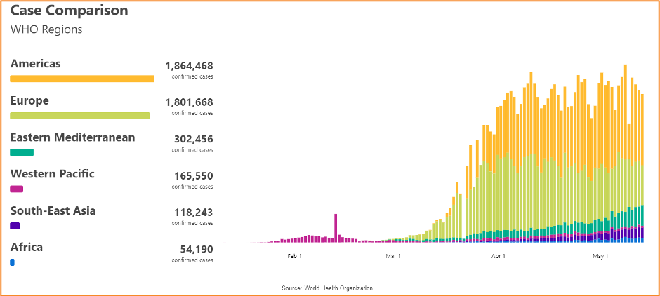
This stacked bar chart compares cases from various regions across a four-month period and was created with data from the World Health Organization. By looking at the title, source, legends, and axes, we can understand the main parts of the chart, but what insights can be drawn from it? One insight is that the number of confirmed cases in the Americas has not decreased considerably in the past month.
More importantly, what can’t we learn from the chart? Look at the number of “confirmed cases.” This number might not represent the total number of people who have been infected, just those who have been tested. If this chart calculates the sum of all confirmed cases in each region, can we assume that all regions have the same capacity to test their citizens?
No. This comparison chart does not tell us whether each region is operating under similar conditions. Regions like Africa might not have the systems in place to conduct tests and produce reports on the number of cases.
We can’t meaningfully compare the cases in each region without first understanding their capacity to report on them. To draw valid comparisons, it’s important to have a comprehensive understanding of each operating environment to avoid drawing false conclusions.
2. When analyzing total COVID-19 deaths per million people, be aware of relative and absolute values
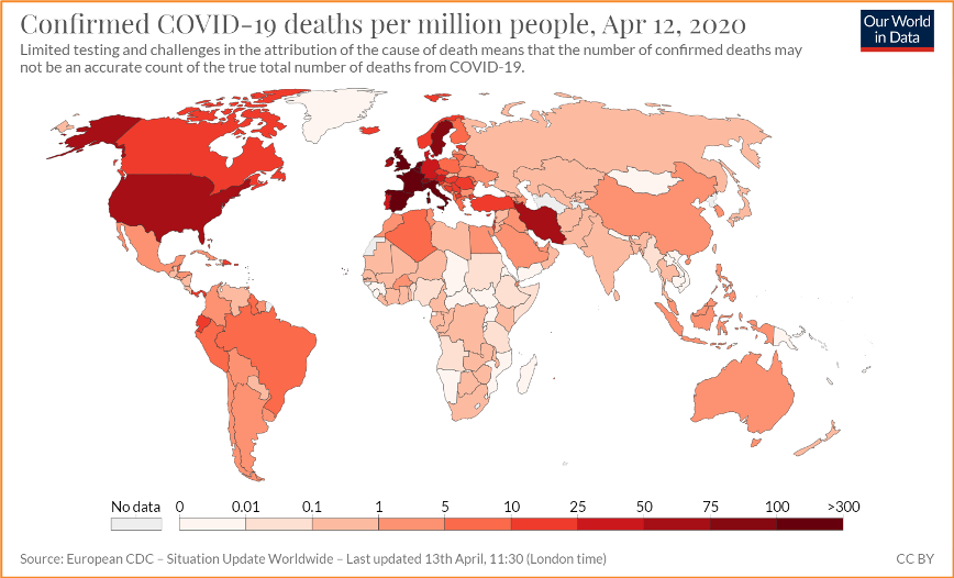
This choropleth map—a thematically shaded map—visualizes the total number of confirmed COVID-19 deaths per million people. It is displaying relative data, as opposed to absolute data. Relative data depicts numbers in proportion to a total. In the map, this total is per one million people. Absolute data, on the other hand, would depict the cumulative number of cases for each country.
Relative values help us make comparisons between countries to understand the severity of the pandemic in different geographies, but what does relative data fail to tell us?
We need additional population data to know the total number of cases in a specific region or country. Larger countries could be disproportionately affected by the disease in one city or town, but the map would not reflect this due to their high population density. A graph like this might give public leaders a false sense of security.
When consulting a choropleth map, leaders must be aware of the limitations in the data presented to identify potential biases that could lead to noninclusive policies.
3. Before comparing two graphs, make sure they both use either a logarithmic scale or a linear scale
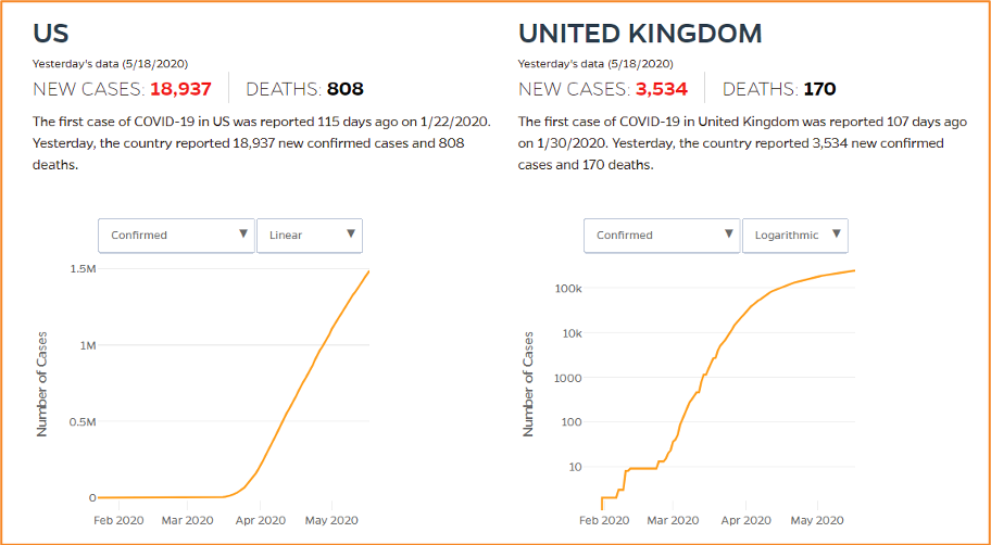
These graphs show the total number of confirmed cases for the U.S. and United Kingdom, but each graph uses a different scale. In a linear scale, the y axis has a constant unit of growth. For example, every third of the U.S. graph represents half a million cases. In a logarithmic scale, each portion of the graph does not have equal increments. In the United Kingdom graph, the bottom fifth represents 10 cases while the top fifth represents 100,000 cases.
As you might have guessed, we cannot compare a graph in a linear scale to one in a logarithmic scale.
What doesn’t a graph in a linear scale tell us? A graph that uses a linear scale is not good at telling us when we’ve “flattened the curve” by stopping the exponential spread of the infection. In contrast, a logarithmic scale is well suited for showing whether exponential growth is continuing.
In the U.S. graph, it will not be easy to determine whether the number of new U.S. cases is declining.
Visualizing COVID-19 data with logarithmic scales is helpful because it provides an overview of the infection’s growth rate and helps public leaders assess the effectiveness of their public health initiatives. While there is no single correct way of visualizing cumulative case data, a logarithmic scale could help a public leader understand whether social distancing is helping to flatten the curve.
Graphs, charts, and maps are helpful visualizations to summarize and simplify COVID-19 data. But public leaders must build their data literacy skills to interpret visualizations accurately. The reality is that leaders are forced to work with incomplete information, but the process of asking questions and acknowledging data gaps can help strengthen their decision-making.